Charts of Interest - Crypto Edition

Stage One Bases, Descending Wedges, and the Asymmetry Starting to Show Up Across Crypto
Crypto is starting to get interesting again. Not because everything is ripping straight up, not because Bitcoin printed a green candle, and not because social media suddenly decided the next crypto cycle has officially begun. It is getting interesting because when you zoom out to the weekly charts, a similar structure is beginning to appear across a large portion of the space. Long standing descending channels are breaking, descending wedges are resolving higher, stage one bases are beginning to mature, prior range lows are being reclaimed, and moving averages are beginning to flatten and, in some cases, curl higher. More importantly, these structures are beginning to create the type of asymmetric opportunities I am always looking for.
That is the focus of this week's Charts of Interest. Before getting into the individual names, there are a couple of concepts worth establishing because they apply to almost every chart in this review. When I am looking at a long descending channel or descending wedge, I generally think about targets in layers. The first target is usually the nearest meaningful pivot high, prior range low, or obvious area of overhead supply. That is the more conservative target and the area where price may initially hesitate, consolidate, or reject. The second target is more aggressive and is generally back toward the area where the pattern originated. If a descending wedge began at $30 and eventually broke out around $8, then $30 matters. That does not mean price moves there in a straight line. It simply means the origin of the decline becomes a logical longer-term objective if the trend continues to repair itself.
That gives us a framework. Target one is the prior pivot or range resistance. Target two is the pattern origin or full measured move. From there, the chart determines the trade and the price action determines how aggressively we manage it. Maybe we take something off at target one. Maybe we raise stops. Maybe price pushes into resistance, tightens up for several weeks, and gives us another entry. Maybe we simply hold a core position and allow the larger trend to develop. We do not need to predict every step. We take the setups as they come.
Bitcoin: The Foundation
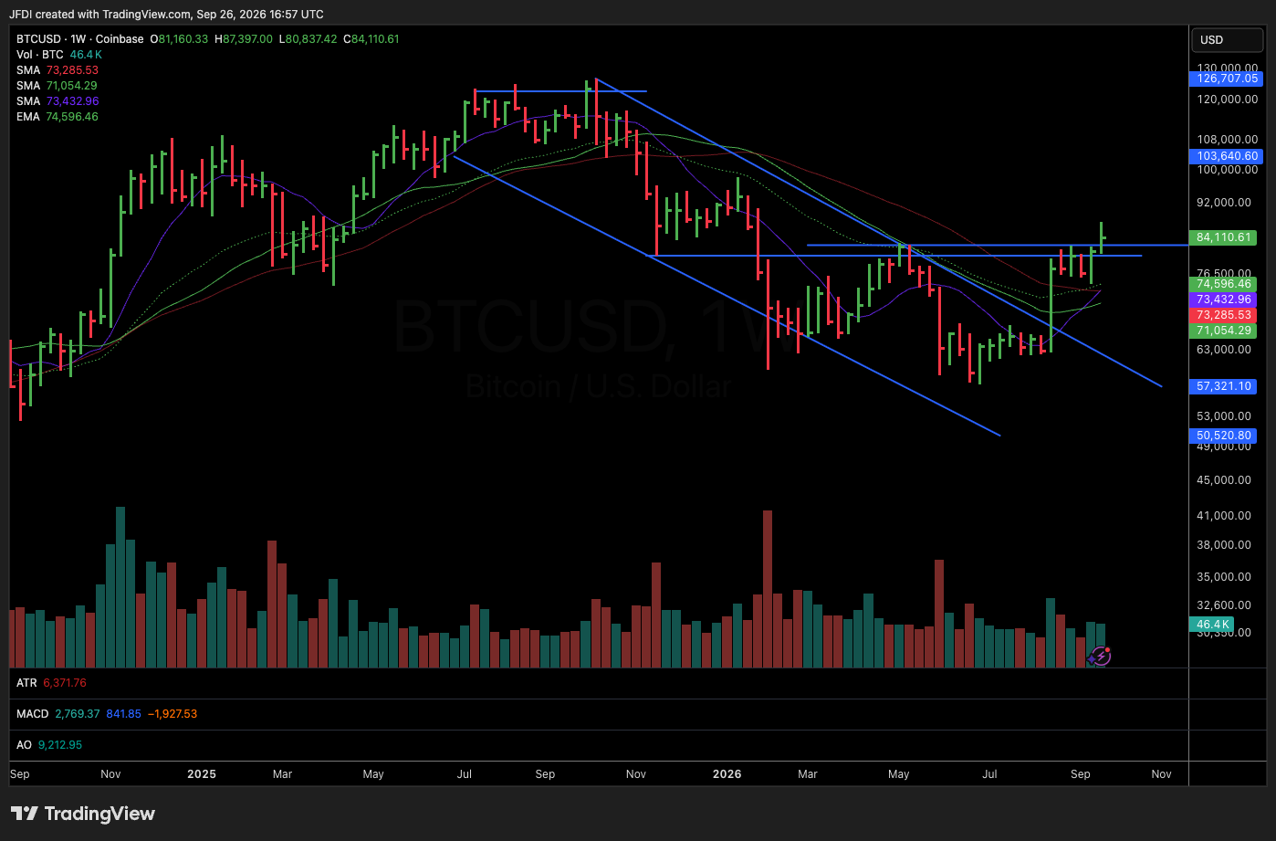
We will start with Bitcoin because whether people like it or not, Bitcoin remains the gravitational center of the crypto universe. Bitcoin topped around October 2025 and spent most of the following months trading inside a prolonged descending channel. The important part of the chart is not simply that price declined. It is how the selling pressure changed as the decline matured. Bitcoin appeared to make something resembling a capitulation low around February 2026. Price eventually came back down and retested that area in June, but the character of the selling was different. There simply was not enough volume or downside pressure to materially push price through the prior low. A few weeks later, price managed to marginally undercut it, but again there was no meaningful expansion in downside participation. Price was making marginal new lows while the sellers appeared increasingly exhausted.
From there, Bitcoin bounced and began moving sideways. That sideways action is where the chart became much more interesting. Rather than immediately reversing into some explosive V-shaped move, Bitcoin began constructing what increasingly looked like a stage one base. That is exactly what you want to see after a significant decline. Time starts doing the work. Weak hands leave, volatility contracts, supply gets absorbed, moving averages flatten, and most importantly, the chart stops going down.
Bitcoin then pushed into the upper boundary of the descending channel and began tightening considerably. On the weekly chart, we had approximately ten weeks of tight price action before Bitcoin finally broke above that descending trend line. Then it tightened again, roughly another four weeks of consolidation near the upper portion of the base before price attempted to push higher. That type of behavior matters because strong trends frequently begin quietly. The crowd usually wants the giant breakout candle. I would rather see compression. Compression tells me supply is being absorbed, and when price spends week after week refusing to give back ground while volatility contracts, eventually something has to give. Bitcoin appears to be transitioning from a long period of decline toward a potential accumulation and early markup phase. Whether that becomes a sustained trend still has to be proven, but structurally, the chart has improved significantly.
Ethereum: Leading the Repair
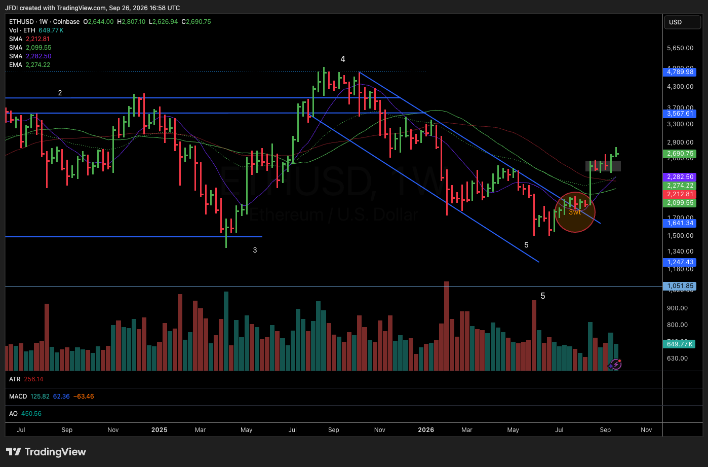
Ethereum has a similar macro structure to Bitcoin, but with a slightly different personality. ETH also entered a large descending channel following its October 2025 highs. Unlike Bitcoin, Ethereum ultimately established a clearer new pivot low before stabilizing, but the important part came afterward. Ethereum stopped trending lower, pushed sideways, and then began leading. ETH broke above its descending channel before Bitcoin and subsequently developed approximately three weeks of tight consolidation. That compression eventually resolved higher.
After the initial expansion, Ethereum again tightened for roughly four weeks before pushing above the $2,500 area, and at the time of this review, ETH is trading roughly in the $2,650 to $2,700 area. Now we get into targets. The first meaningful upside objective sits around $3,300, which represents a logical intermediate target based on the prior structure and overhead resistance. Beyond there, the larger objective is a retest of the upper portion of the historical range somewhere around $4,300 to $4,700.
That is where Ethereum becomes even more interesting. Zoom the chart out further and ETH is potentially sitting inside an enormous stage one structure. You can broadly define that range somewhere around $1,000 on the bottom and roughly $4,700 on the top. That is approximately a $3,700 range. Round it and call it $4,000. If Ethereum eventually repairs the entire structure, pushes toward the highs, consolidates near those highs, and ultimately breaks through that larger range, the measured move becomes substantial. A roughly $4,000 range added to a breakout near $4,700 begins pointing toward an eventual $8,000 to $9,000 zone. Again, that is not a prediction that ETH is going to $9,000 next month. It is simply how measured moves work. Structure gives us a roadmap, but price still has to earn every level along the way.
Solana: Reclaim the Range and Watch What Happens
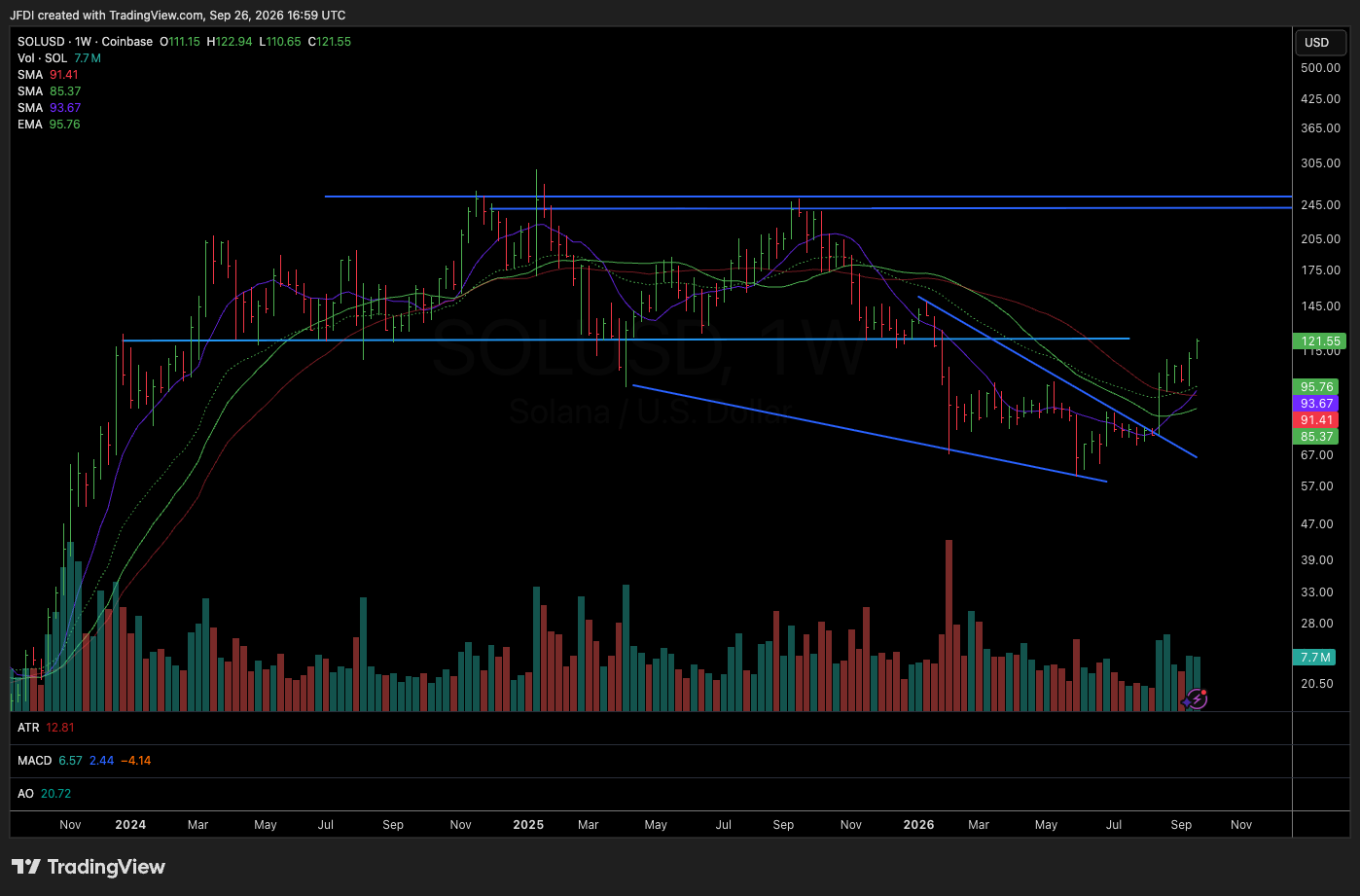
Solana has actually held up reasonably well from a structural perspective despite experiencing a brutal drawdown. Price fell from roughly $270 down toward $60 at the lows, which is significant damage, but the weekly chart has now developed something resembling a large descending wedge. At the moment, the $110 to $120 region appears extremely important. That zone represents a major area for SOL to reclaim and hold, and if it does, the chart begins opening the door toward the upper end of the former range somewhere around $230 to $250.
There is a simple market principle worth remembering here. When price loses the bottom of a range, breaks down, then eventually reclaims that range low, you should at least begin considering the possibility that price gravitates back toward the opposite side of the range. Markets are constantly moving between areas of accepted value. Using round numbers, imagine the larger Solana range running from roughly $100 to $250. That is approximately 150 points. If SOL eventually repairs the entire range, pushes back toward $250, builds another constructive consolidation, and ultimately breaks out, another 150 points added to the breakout begins producing targets well north of the prior highs. Depending on how the eventual structure develops, a $400 to $500 SOL becomes mathematically reasonable as a longer-term measured move. Price obviously has a tremendous amount of work to do before that becomes relevant, but understanding the larger structure gives context to the smaller setups occurring today.
XRP: A Classic Descending Wedge
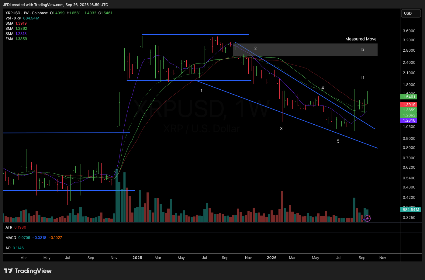
XRP may be one of the cleaner descending wedge structures in the group. The weekly chart has that classic compression where lower highs and lower lows gradually converge until volatility becomes increasingly constrained. That is where asymmetry begins to show up. XRP is currently trading around the $1.50 area, with the first major objective sitting near $2.00. That is the obvious nearby resistance zone and therefore a logical first target. The second objective sits closer to where the larger wedge originated, approximately $2.80 to $3.00. That gives us a much larger structural target.
The interesting part is not simply the upside number. It is what could develop along the way. If XRP pushes toward $2.00, consolidates, and then continues building out the right side of this larger base, the weekly chart could eventually begin taking on something resembling a cup structure. Maybe it does, maybe it does not. We do not need to force the label. The point is that once price begins repairing the right side of a major base, additional opportunities frequently emerge. You may get another tight weekly pattern, a shallow pullback, a breakout and retest, or moving averages beginning to curl underneath price. That is why I rarely look at these situations as one entry and one exit. A major trend can provide multiple opportunities to build exposure.
The Bigger Crypto Theme
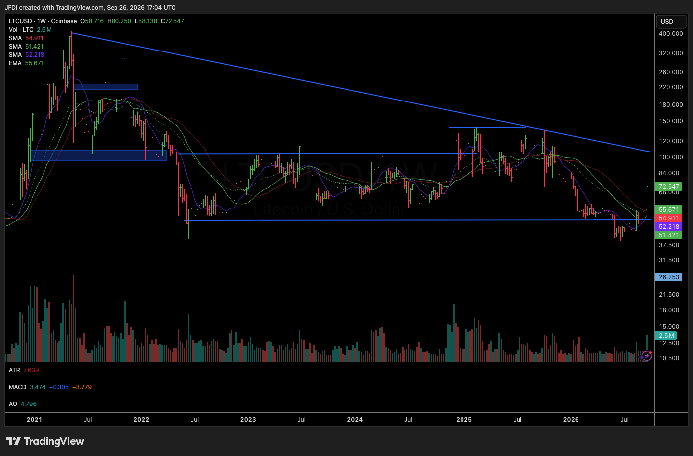
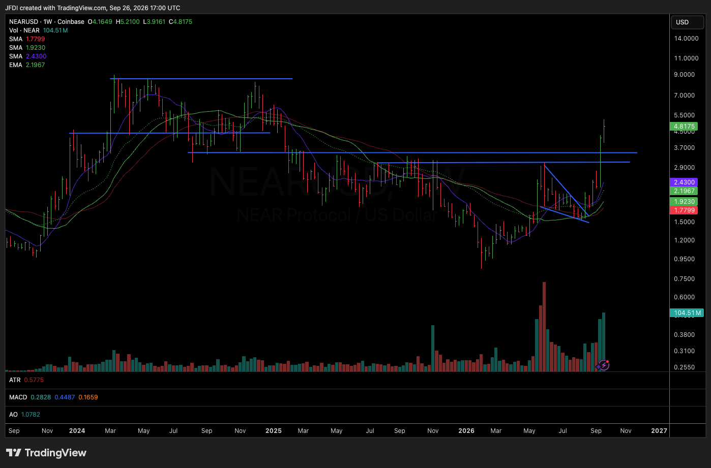
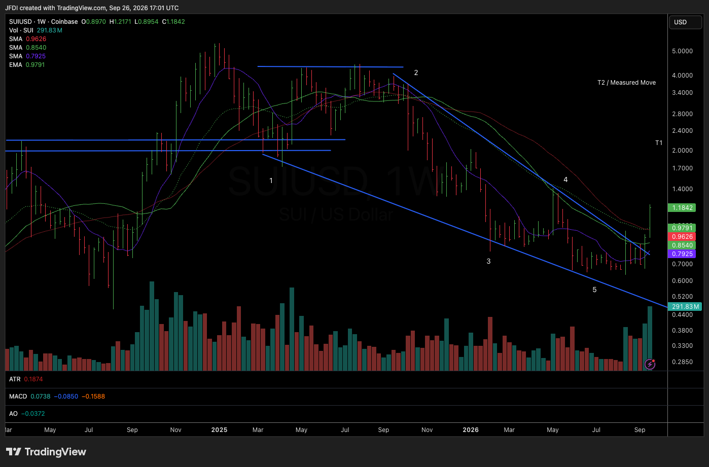
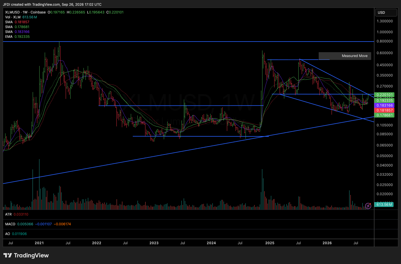
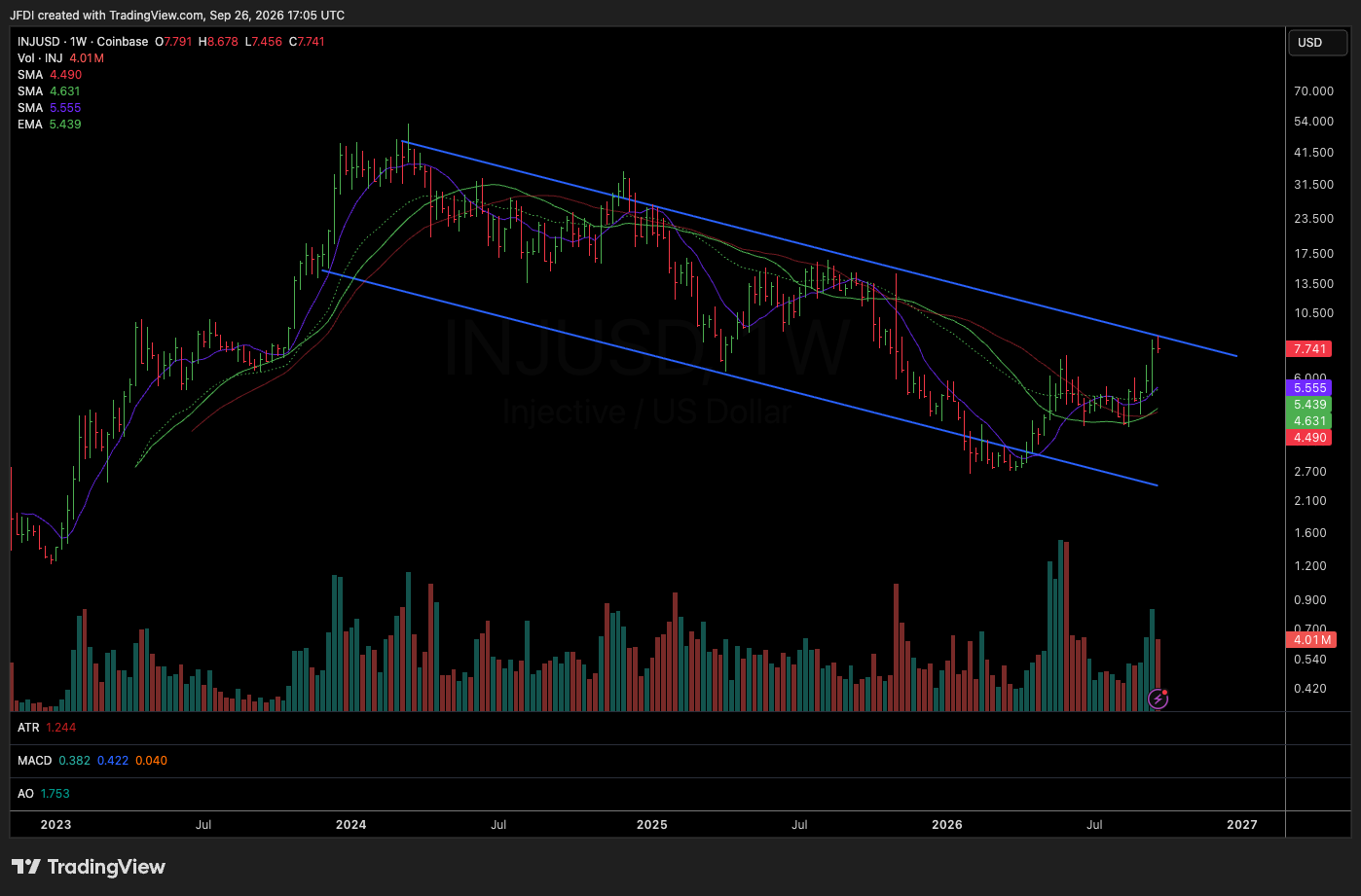
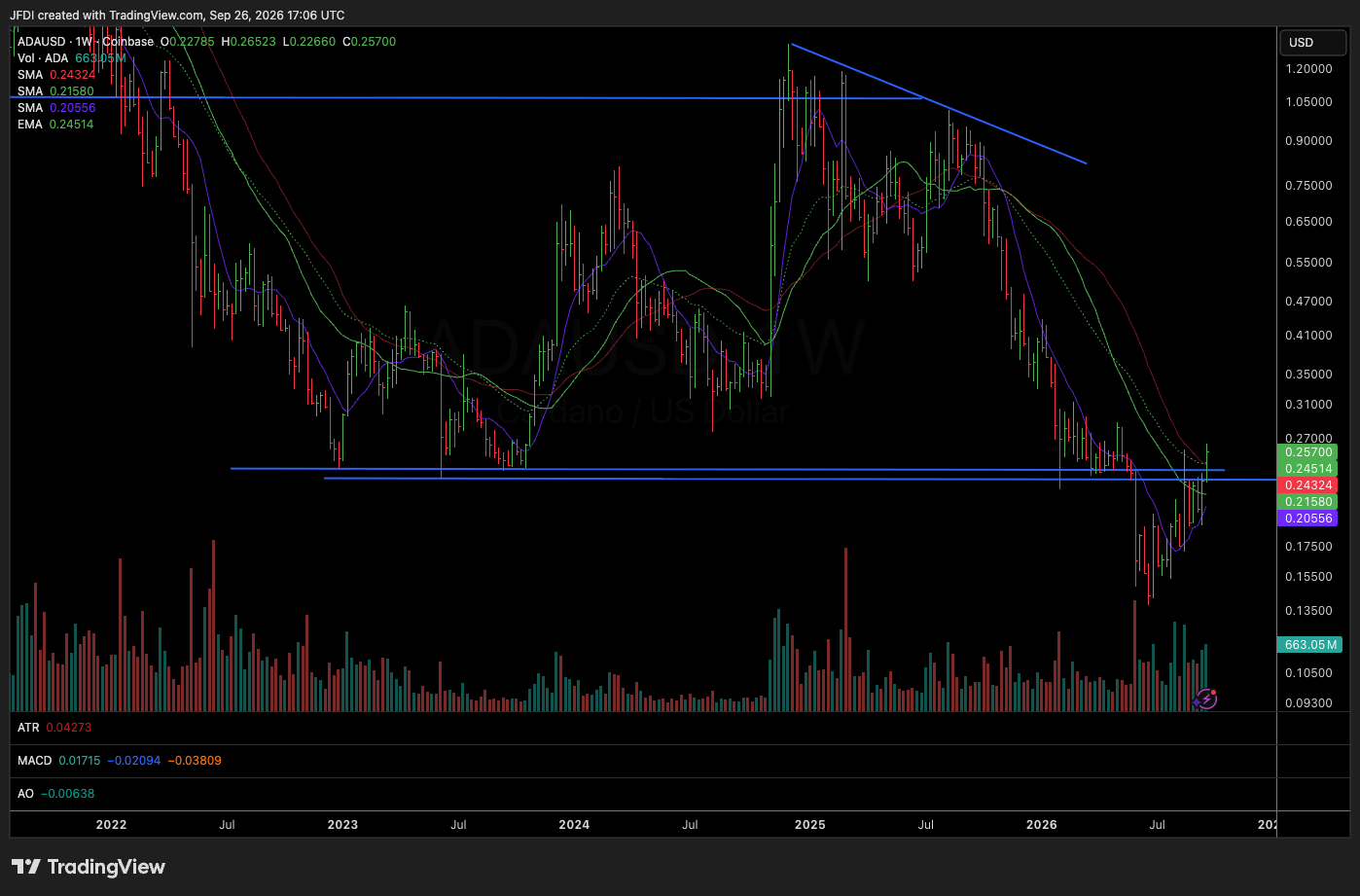
This is where the broader crypto picture gets compelling. Bitcoin and Ethereum naturally receive most of the attention, but underneath the surface we are seeing very similar descending wedge structures across a large number of names. XRP, DOGE, SUI, XLM, UNI, INJ, LINK, AVAX, ADA, HBAR, NEAR, and others all have some variation of the same technical theme developing. When the same structure begins appearing simultaneously across an entire asset class, I pay attention.
That does not mean every chart works and it does not mean every token becomes a monster winner. It means there is a common technical condition developing across the space. More importantly, descending wedges can create tremendous asymmetry, and that is what I care about. I do not need certainty. I need a setup where the amount I potentially make significantly exceeds the amount I am required to risk. That is the entire game.
Why Descending Wedges Can Be So Powerful
A descending wedge represents compression inside a declining trend. Price continues making lower highs and lower lows, but the distance between those swings gradually contracts. The decline is losing momentum. Sellers continue pressing price lower, but each push becomes less effective. Eventually price begins pressing against the upper descending trend line, and once that trend line breaks, particularly after a long-duration pattern, the risk/reward can become exceptional.
Think about XRP. Around $1.50, depending on entry and stop placement, maybe the risk is approximately $0.30 toward the $1.20 area. The first target is around $2.00, while the larger target is somewhere around $2.80 to $3.00. You are risking roughly $0.30 for the possibility of $1.30 to $1.50 upside. That is asymmetric. If the longer-term structure eventually develops into something larger, the reward can expand significantly beyond the initial measured move. This is why I am willing to spend so much time scanning these patterns. The goal is not to find something that cannot lose. That does not exist. The goal is to find situations where we can define risk tightly while leaving substantial room for the upside to surprise us.
AVAX: One of the Cleaner Opportunities
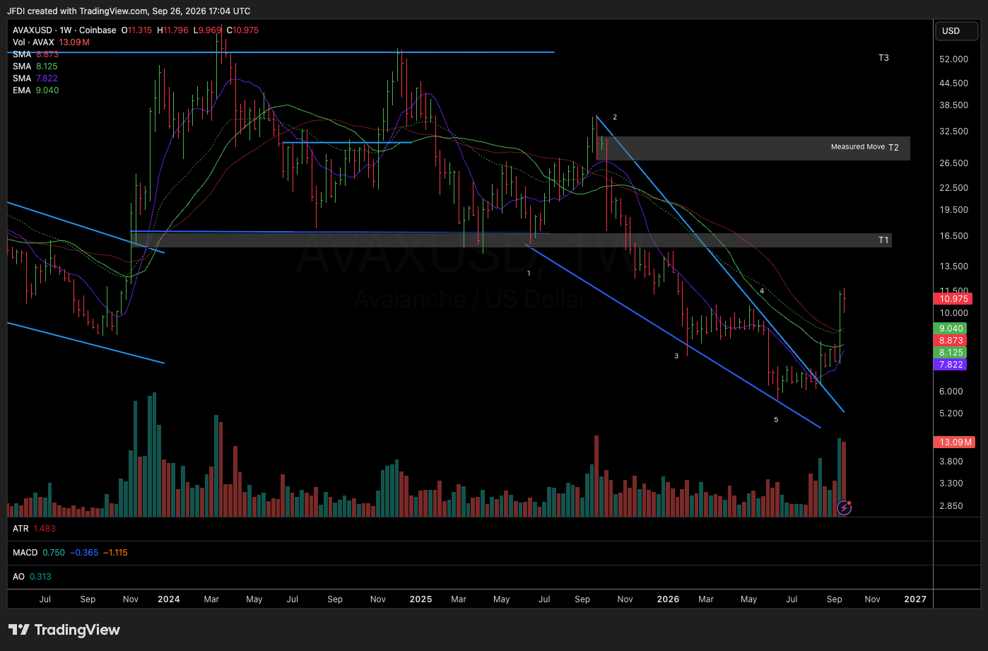
Avalanche is another excellent example. AVAX has been building a significant descending wedge and has already started breaking through the upper boundary. The initial breakout occurred around the $7 area, with price now trading closer to $10. The larger measured move points toward roughly $30, which immediately creates an interesting relationship between risk and potential reward. At current levels, depending on how someone chooses to structure the position, perhaps the broader stop is somewhere around $6 to $7. That creates approximately $3 to $4 of downside against potentially $20 of upside toward the larger measured move.
There may be an even cleaner scenario developing, though. AVAX is currently beginning to tighten after the breakout. Ideally, I would like to see something resembling a three-weeks-tight pattern develop here. Let the moving averages begin curling upward underneath price, let volatility contract, let buyers and sellers reach equilibrium, and then allow the market to show its hand. If AVAX eventually breaks above that three-weeks-tight structure, the low of the pattern potentially becomes a much cleaner place to define risk. If that low is approximately $9.50 to $9.60, suddenly you may have a much tighter entry against the same larger upside objective.
That is where adding exposure can become extremely powerful. Maybe the initial position was taken on the wedge breakout around $7. The three-weeks-tight becomes another opportunity to leg into the trend. That is how positions can be built intelligently. You do not need your entire position at the first breakout. Let the market confirm the thesis, then build. The first major objective for AVAX is probably somewhere around $15 to $16 near the lower boundary of its former range, while the next major objective sits closer to $30. From there, manage the trade based on what price actually does when it reaches those levels.
HBAR: Another Asymmetric Wedge
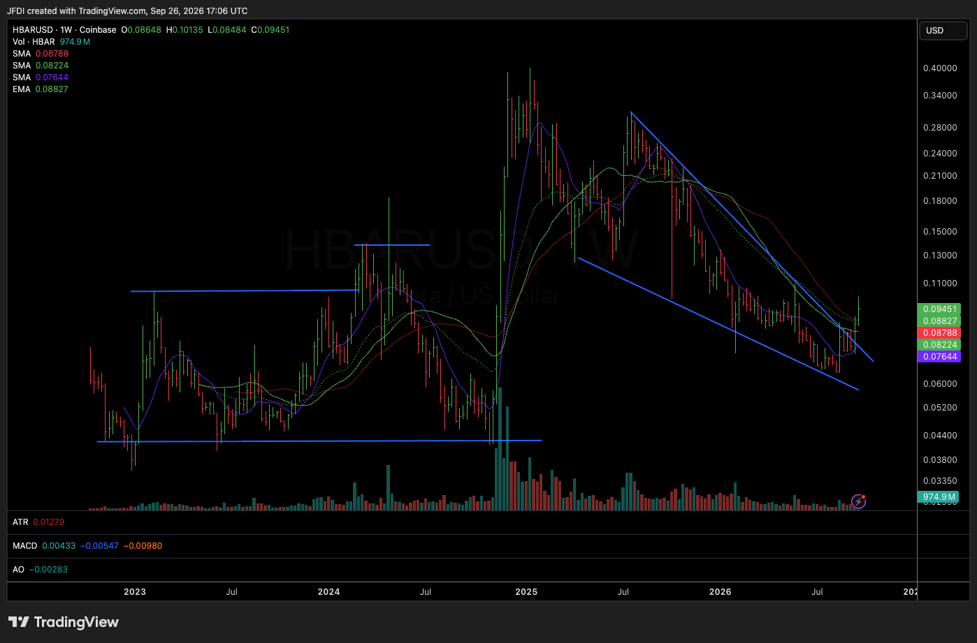
HBAR has another clean descending wedge beginning to resolve higher. The breakout area sits around $0.08, and depending on how aggressively someone wants to manage risk, a logical invalidation zone could sit somewhere around $0.065 to $0.07. Meanwhile, the upside structure points toward approximately $0.20 to $0.30. Think about that mathematically. You may be risking roughly one to two cents in exchange for the possibility of twelve to twenty-plus cents of upside. That is exactly the type of asymmetry I am looking for. Again, the chart still has to work. The breakout could fail. Every setup can fail. But failure is acceptable when it is cheap.
LINK: Relative Strength Matters
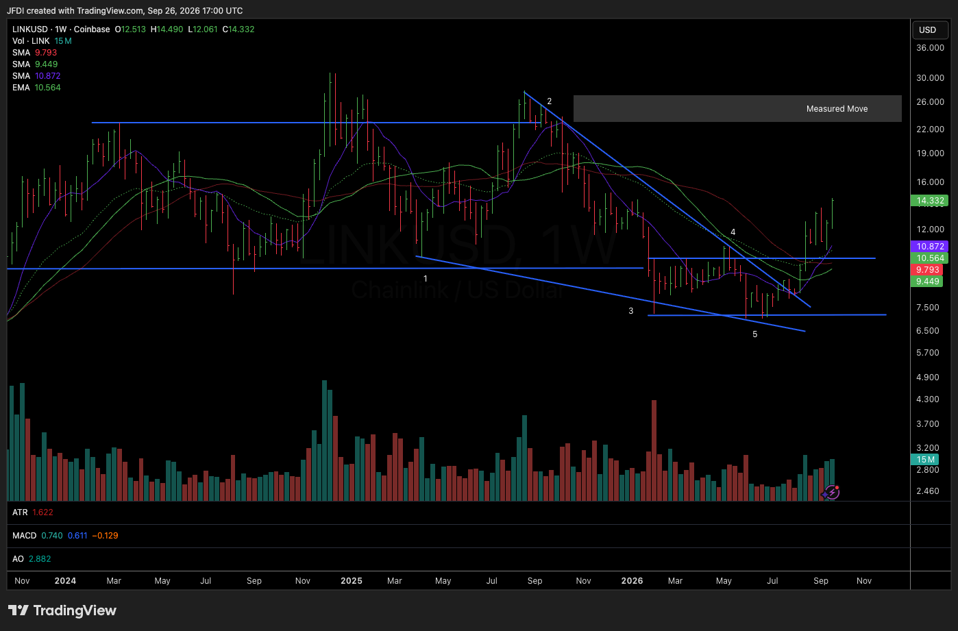
Chainlink is one of the stronger-looking names in the crypto basket, and that matters. When an entire group begins improving, I naturally want to identify which assets are leading the move. LINK has already reclaimed the lower boundary of its prior trading range. Broadly speaking, that range extends from approximately $8 to $24 or $25, with the key reclaim area sitting around $9.50. LINK moved back above that level and has continued improving.
Once price reclaims the bottom of a major range, the natural structural target becomes the opposite side. That puts approximately $24 to $25 into focus. LINK therefore looks less like an early wedge trade and more like a continuation trade already progressing toward its measured move. That does not automatically make it worse. In fact, strength tends to attract strength, and the strongest assets often continue outperforming once capital begins flowing back into a sector. LINK absolutely belongs near the top of the focus list.
UNI: Managing the Trade as It Works
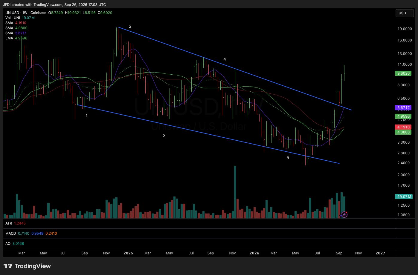
Uniswap is another good example because it illustrates how targets can be managed in real time. UNI broke out of a wider descending wedge and has already continued significantly higher. The wedge initially offered entries around roughly $4.50, while price later provided another opportunity around the $5 to $6 area as it retested or interacted with the descending trend line. Now price is approaching the first major target around $10 to $11.
This is exactly where trade management becomes personal. Someone may choose to take partial profits, someone may raise their stop, and someone may sell nothing and continue holding for the larger measured move. None of those approaches are inherently right or wrong. The important part is understanding what the chart is telling you before emotion gets involved. For UNI, the more aggressive longer term measured move sits around $18 to $19. Someone who entered between $4.50 and $6 has accumulated a considerable cushion, and that cushion creates options. You can sell some and hold the rest, trail underneath weekly lows, wait for another consolidation and potentially add, or simply allow the position to breathe. There is no single perfect exit strategy, but there should be a strategy.
Stop Thinking About Crypto as a Lottery Ticket
This is probably the biggest takeaway from the entire review. Too many people approach crypto like a casino. They ask which coin is going to 10x, chase whatever moved the most yesterday, buy after vertical candles, and then panic when price inevitably pulls back because they never understood where the trade was invalidated in the first place. That is not how I approach this.
I approach crypto the same way I approach equities. Structure, trend, compression, expansion, risk, reward, position sizing, and time. The asset class may be different, but human behavior is not. Charts are simply visual representations of fear, greed, supply, demand, positioning, and time. Those dynamics exist everywhere.
The Weekly Chart Changes Everything
Most of these setups become far more interesting when viewed through the weekly chart. Daily volatility in crypto can be enormous, and that volatility causes traders to constantly second-guess positions. A 10% pullback can feel catastrophic on an intraday chart while barely registering inside a multi-month weekly structure. The weekly chart removes noise. It forces patience and gives us a much cleaner perspective on what the larger trend is actually doing.
When we are dealing with patterns that developed over six months, nine months, or a year, it makes very little sense to expect the entire measured move to occur in five trading days. Long patterns require time. That is why position sizing matters so much. The goal is to size the trade small enough that normal volatility does not emotionally force you out, but large enough that the eventual move actually matters. That balance is where trading becomes an art.
How I Think About Building These Positions
When I identify a large weekly structure like these, I am generally thinking in stages. The first entry may occur as price breaks the descending wedge. Then price may retest the breakout, creating another opportunity. Maybe price pushes higher and forms three-weeks-tight. Maybe it reclaims a major moving average, reclaims the bottom of the prior range, or builds a higher low. Every one of those events can provide additional information.
The market is constantly communicating. We simply have to stop demanding that it tell us the entire story on day one. That is why I prefer building positions as the thesis becomes increasingly validated. I would rather add to strength. Let the market prove the thesis, then allow your exposure to grow alongside that proof.
Risk First, Upside Second
Whenever I talk about measured moves like $30 AVAX, $3 XRP, $25 LINK, or potentially $8,000-plus ETH, people naturally focus on the upside. I focus on the other side first. Where am I wrong? Where does the structure fail? How much capital am I willing to lose if it does? That is what makes these setups powerful.
It is not that the upside target is guaranteed. It is that the downside can often be clearly defined. If I can risk one unit to potentially make five, six, eight, or ten units, I do not need every trade to work. I need discipline, patience, and the ability to repeatedly take asymmetric bets without emotionally attaching myself to any single outcome. That is trading.
The Broader Picture
The important development across crypto right now is not one breakout. It is the breadth of improving structures. Bitcoin is breaking from a prolonged descending channel. Ethereum has already shown relative strength and is beginning to push higher. Solana is attempting to reclaim a key former range. XRP is breaking from a clean descending wedge. AVAX is doing the same. HBAR is emerging, LINK is showing leadership, and UNI has already begun progressing toward its upside targets. Underneath those names we still have DOGE, SUI, XLM, ADA, NEAR, INJ, and others showing similar structural characteristics.
One chart can be noise. Ten charts beginning to tell the same story deserves attention. That does not mean blindly buying everything. It means paying attention. Build the watchlist, set alerts, identify the strongest charts, define your risk, know your levels, and then wait.
Final Thoughts
This is exactly why I spend so much time studying long term charts. The opportunity often begins forming months before the crowd notices. By the time everyone becomes excited, much of the easy asymmetry may already be gone. Right now, crypto is showing a collection of long-duration setups that deserve attention. Stage one bases, descending wedges, descending channels, range reclaims, weekly compression, and relative strength are all beginning to show up across the space.
None of that guarantees anything, but trading is not about guarantees. It is about putting capital into situations where the mathematics are tilted in your favor. Risk small, give the position room, let time work, take some off when price reaches logical resistance if that fits your strategy, raise stops when structure allows, and add when the market gives you another clean setup. Above all, do not force it.
We do not know whether these charts break and sprint directly toward their measured moves, whether they stair-step higher for the next six months, or whether some simply fail and return to their bases. Only time will tell. Our job is simpler than that.
Identify the structure. Define the risk. Take the trade when it is there. Then let price tell you what comes next.